Graphic Designer
Monk Shoe Repair
THE BRIEF: (Student project) Design a logo, stationery package, magazine ad, and three branded items for a fictional company from an industry that struggles to get noticed.
To imagine this fictional company, I thought about the kinds of businesses are typically found on the side streets of a town or city. It wouldn’t be on the Main Street, maybe on a small street that doesn’t get much traffic. Perhaps a family business that has been there for a couple of generations.
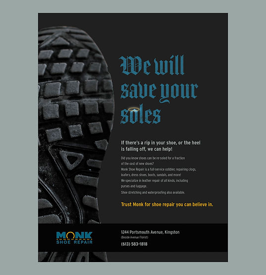
I wanted the logo to be simple, appropriate for a small town family business, and settled on an idea that communicated “shoes” with the upper section, yellow lace, and the sole, without being so literal as to take on the shape of a shoe.
The magazine ad plays on the spiritual nature of the name “Monk”, and the sole/soul.
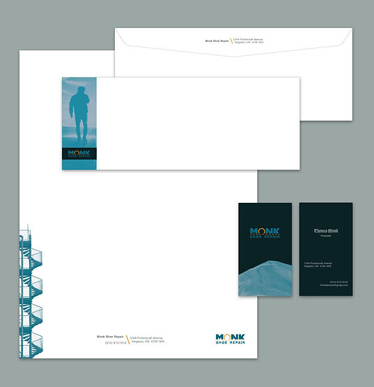
For the stationery and branded items that might be found in a shoe repair business I made use of imagery that could communicate how your soles could be worn an be in need of saving (stairs, landscape through which one might take long treks, a dry desert.)

Unless otherwise stated, all photographs and copy used in this school project are for conceptual purposes only. I do not own them, and all credits are given to the original creators.